
Spells cast:
Brand Naming + Storyline
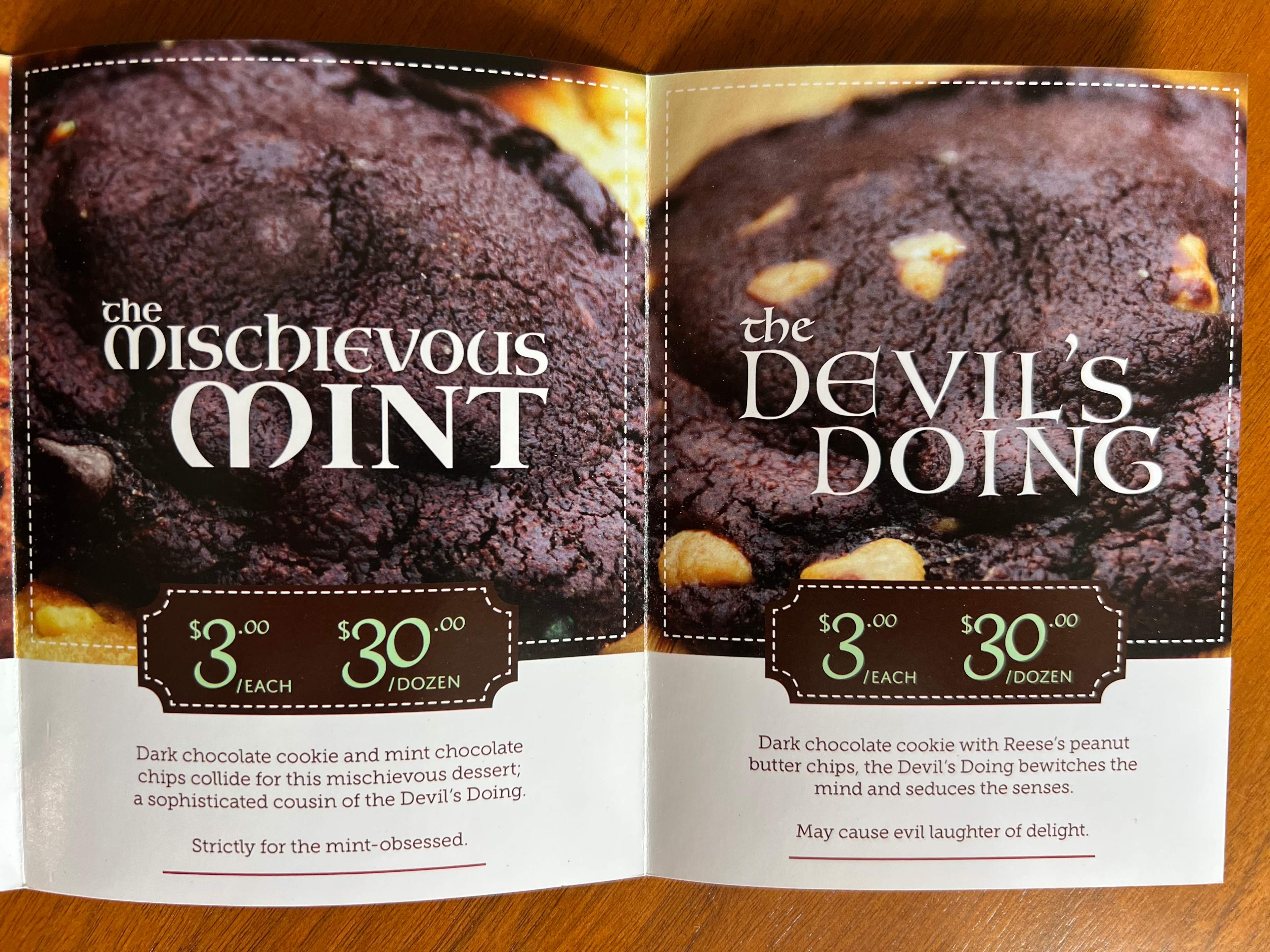
Packaging Copy + Design Direction
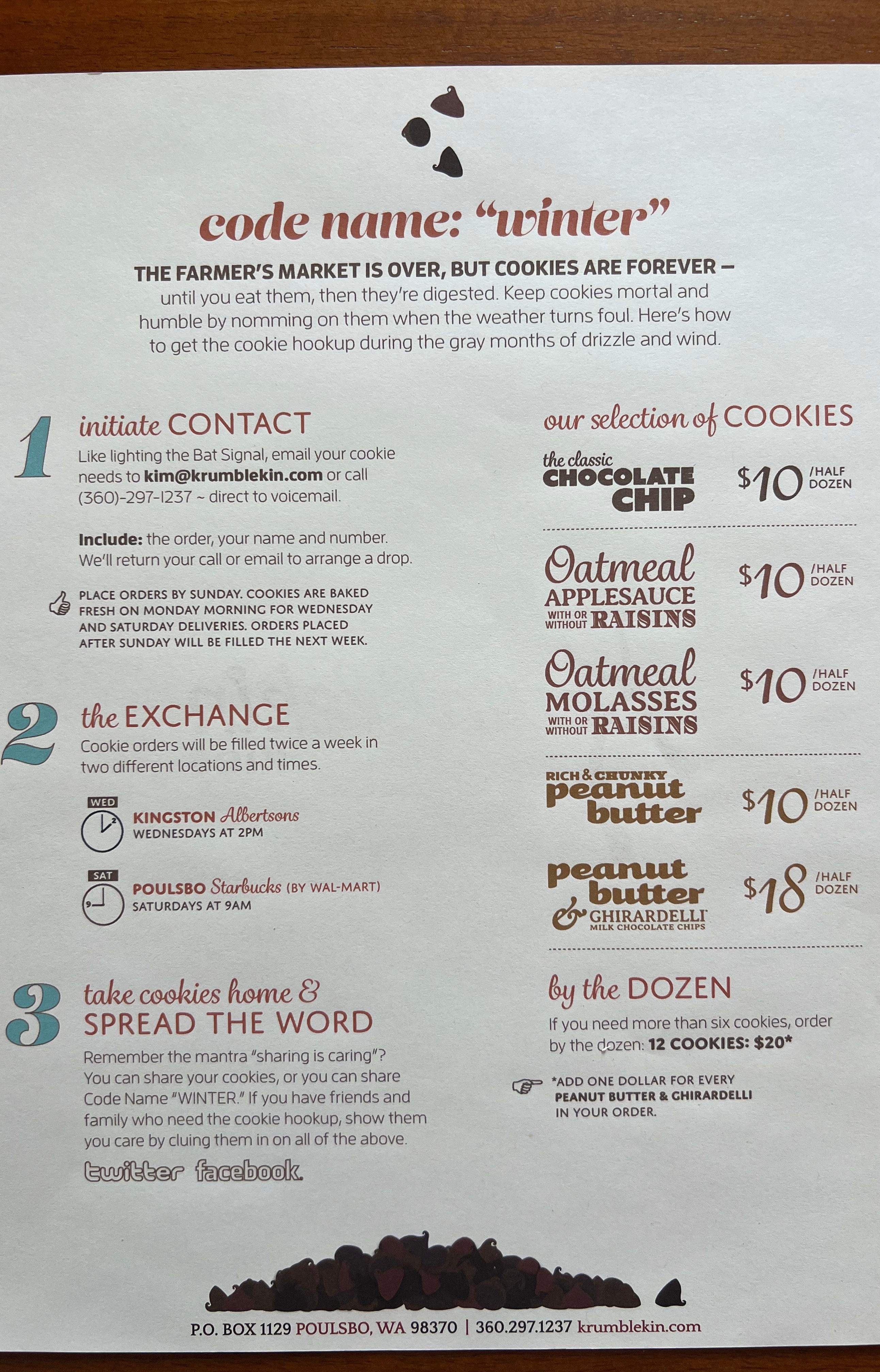
Farmers Market Display
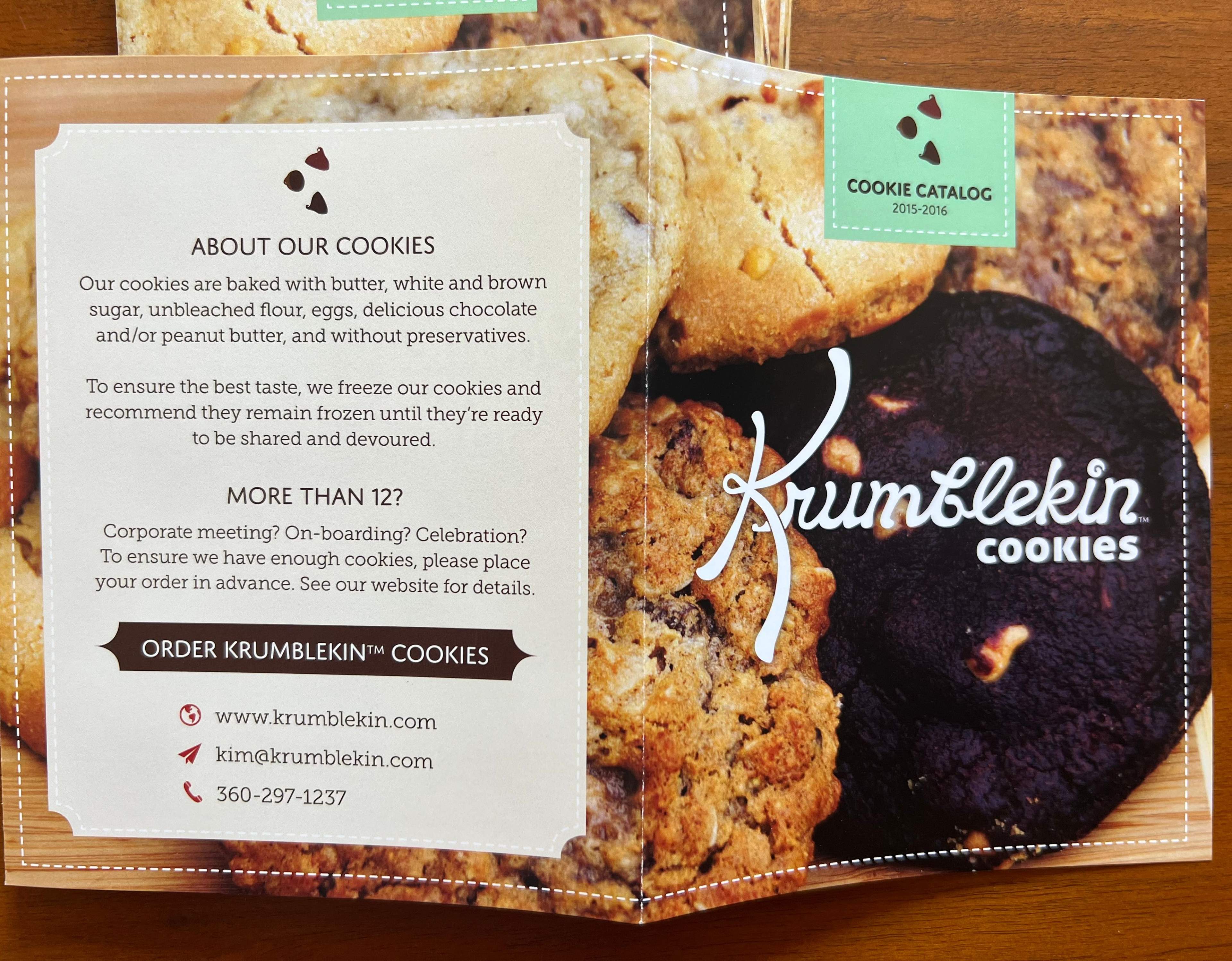
Printed Collateral (menus, signs, takeaways)
Website Copy + Navigation
Weekly Brand Messages (for networking groups)
Visual + Verbal Brand Cohesion
Krumblekin Cookies wasn’t just about cookies. It was about creating a brand so charming, people would crave it before the first taste.
I named it, weaved the origin story, and gave it a voice straddling whimsy and wit.
From handwritten-style signage to on-brand taglines she used during in-person networking, every touchpoint whispered the same thing: “This is more than a cookie. This is magic, baked.”
We launched her farmers market booth with intention and lore: eye-catching displays, smart packaging, and stories for each flavor. It worked. People didn’t just remember the name, they told the townsfolk. The brand power. And real butter.
The conjuring
The brand wasn't baked around the cookie. It was baked around how you feel while eating it.
Mainly, transported to a time when you didn't care about calories, indulgence, or enjoying yourself with a tasty treat. Childhood.
"Krumblekin" is cottage core before we had the term "cottage core." It hearkens to the magical time in our lives before the world's realities corrupted us all. Not to get too heady or anything.
The creations
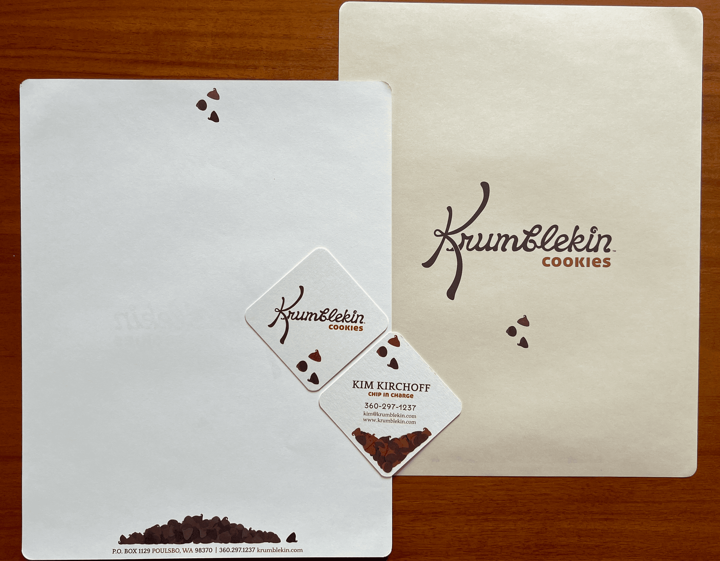
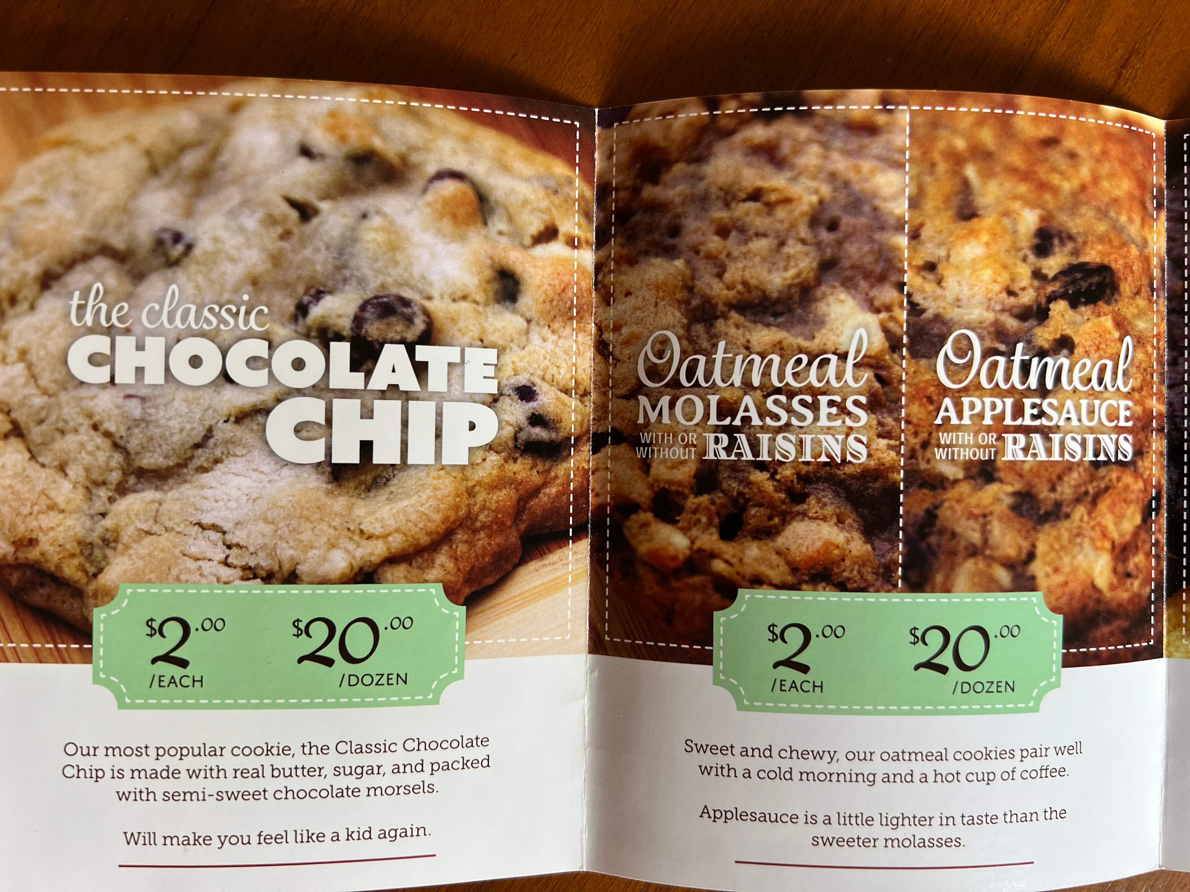
The logo borrows the whimsical "K" from the baker's signature.
"And let the chips fall where they may" inspired the three (the most holy of numbers) falling chips used throughout the printed and digital collateral.
Specially branded cookies, with a little dash of magic.
Cookie commercials that made people hungry (and refer me)
Weekly BNI scripts with humor, strategy, and real butter
In addition to naming, packaging, and storytelling for Krumblekin Cookies, I wrote dozens of 60-second commercials for the business networking group BNI.
Each commercial reflected a different angle of the brand, from seasonal flavors and parenting wins to gluten-free sarcasm and tactical cookie strikes.
These weren’t just much-looked-forward-to announcements among a litany of boring elevator pitches. They were micro-stories designed to stick in people’s minds—and get referrals. (They worked.)
Cookie public service announcement
“It’s come to our attention that eating one of our chocolate chip cookies can lead to misplaced chocolate smudges...often occurring on cell phones. Please gobble responsibly.”
Peanut butter cookie deployment
“Peanut butter now hits somewhere between deliciously satisfying to Dear God in Heaven this is good, is it bad if I have a few more?”